Total Pageviews

Showing posts with label User Experience. Show all posts

Sunday, August 20, 2017

UI/UX Design: A Reworking of Subnautica's Interface

Overview

Subnautica is an open-world survival game currently available through early-access on steam (as of the time of this publication). I love the immersive atmosphere of the game and the stunningly beautiful geography. This game is full of creative innovations and I have enjoyed it thus far with only one exception: the user interface. So I decided to do a critical analysis of the design and usability principles being used in the Subnautica UI to evaluate if changes could be made to improve the player's immersion.

Identifying Issues

To accomplish this, I used Universal Principles of Design, by William Lidwell, Kritina Holden, and Jill Butler. I started off by just playing the game and jotting down notes of thing I noticed. Then I consulted the design principles to identify and understand any issues in the user interface. This collection of principles helped me identify 5 key elements that were lacking: Uniform Connectedness, Comparison, Immersion, Mental Model, and Propositional Density. Here are how they are defined in Universal Principles of Design. 

Uniform Connectedness: Elements that are connected by uniform or visual properties, such as color, are perceived as being more related than elements that are not connected.
Comparison: A method of illustrating relationships between patterns in system behavoirs.
Immersion: A state of mental focus to intense that awareness of the real world is lost.
Mental Model: People understand and interact with systems and environments based on mental representations developed from experience.
Propositional Density: The relationship between the elements of a design and the meaning they convey.

These principles of design mostly focus on the relationship between the player and the user interface. They are all related to each other and will help make a seamless interface.

Here is the current user interface, in-game. 


As you can see, the game is full of these really immersive environments, but the UI pulls you out of that. Changing between tools means looking at icons just floating over the first-person perspective. The stat overlays (oxygen, health, nutrition, and dehydration) look odd as well. The color and theme are not coherent or constant between elements. So it will obviously be important to tie these elements together, bringing uniformity and immersiveness to the player. 

Prototyping Solutions

One system already used in the game is the PDA, an in-game interface that allows players to conduct various tasks. The important thing about the PDA is that it's digetic, allowing us to maintain immersion without losing functionality. Its something I kept in mind while examining solutions. I started by scrapping the entire UI. The tool selection, stats, and depth were all removed so I could start from scratch. I then started reworking the stat overlays.

First, I started workshopping different ideas for to to relay this information without using icons. To really help sell the immersion of this information, I decided it should all be incorporated into the gameplay itself. After doing some research on what real symptoms would arise from dehydration and starvation, I had a strong foundation. This foundation, of stats being relayed through physical changes, also served to tie all the elements together. 

Immersive Stat Overlays

Stat                                                                                                               Suggested Interaction
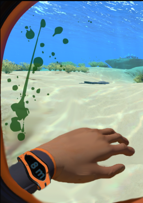
Health                                                     Blood on inside of visor, flooding more as damage is taken
Oxygen                                                                                                           Bubble Gauge Indicator
Dehydration                                                                                                  Blur/dizziness to emulate
Nutrition                                                                                                    Hands shake/hypoglycemic

Initially, I thought it would be interesting if the tools were being projected through Augmented Reality on the PC's hand.


This seems to be more intuitive to the VR version of the game, but I wasn't sure it would translate smoothly. While hotkeys 1-5 are still used, the icons are moved off the floating UI and instead projected on the character's hand.

Eventually, I decided to get rid of the icons and go with a holographic projection, since this is a sci-fi game, but I think either one works.


Changes took several iterations to find a system that congruently presented itself as immersive to the game world. Finally, I landed on these changes.

New Interface


Since dehydration and starvation are now conveyed through visual feedback systems, there is no need for them in the UI. Since starvation will be shown through shaking hands, there is no real way to show this through a screenshot. Here is another look at the UI however, with dizzyness and blurriness being shown to indicate dehydration.


And one last show showing what a high damage scenario looks like.


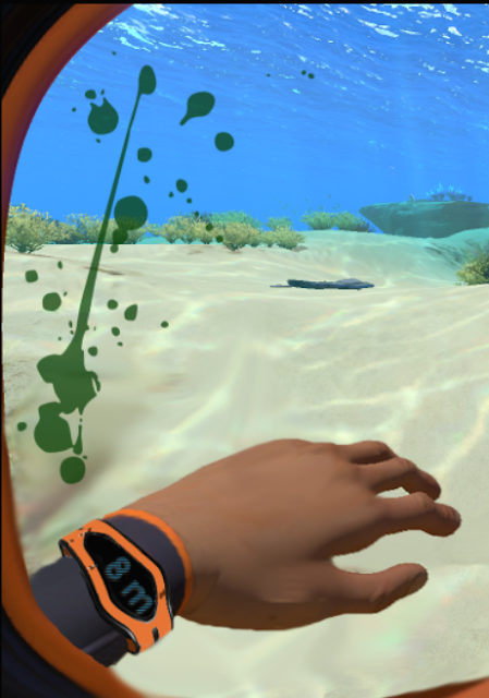
Alternatively, I was informed that blood appears green underwater, due to the nature of the water absorbing the color red. Here is an alternative blood color to help weave together more immersiveness. It also makes the game more "alien" in nature, which fits with its genre.

Conclusion

So in conclusion, I think I was able to identify a few areas of the user interface that really benefited from immersive changes. Through design principles, I was able to create a user interface that is (hopefully) more intutitive and easy for the player to use, without losing functionality or immersion in the game world. Here is a final side-by-side comparision of the UI, mine and the original.


Monday, February 6, 2017

User Experience Feedback

A few months back, you might remember a post here about my participation in helping run a Student Game Expo (SGX). Since then, the monthly expo has grown exponentially and pulls in a good crowd every month. Though not actively running the SGX anymore, this month I did contribute by developing a way to get feedback from SGX attendees. One of the most valuable tools at a dev's disposal is the player. Understanding who your target audience is and what they think of your game could dramatically guide the direction of development. Thus I saw the SGX as an opportunity to gather feedback directly from the player, that I could then turn around and disseminate back to the teams.

With a thorough background in user experience, flow state, and video game heuristics, I set out to develop a feedback form that would provide the developers with valuable information. To this end, I pulled upon previous research I had conducted and used The Play Experience Scale: Development and Validation of a Measure of Play by Pavlas, Jentsch, Salas, Fiore, and Sims as a starting foundation. I also used Game Usability Heuristics for Evaluating and Designer Better Games by Heather Desurvire and Charlotte Wiberg to determine a sustainable formula for measuring heuristics.

Next, I developed the feedback form online using Google Forms and set it up for the SGX. I was there facilitating the feedback station to help the SGX attendees provide their thoughts. I also had a section on the form that would allow players to provide their own feedback directly to the developers. After the event, I consolidated the raw data collected and started charting and graphing the results. My ultimate goal was not to just dump the raw data to the team, as they might not have the same experience and understanding of video game UX. The information should be easy to read and understand by the teams, to ensure they can get the most out of it. After I was done, all that was left was providing the data to the teams. Below is a sample of how I presented the feedback to a team.


User-generated feedback should always play a part in informing the developers what people want from their product. Even just making the team aware of things they might have overlooked can be extremely helpful for teams that inadvertently suffer from tunnel-vision after months of working on a project. Got questions about obtaining UX feedback for your game? Comment below and I'll be glad to help!