Total Pageviews

Showing posts with label Art Creation for Games. Show all posts

Tuesday, July 3, 2018

Holograms: Breathing Effect

Been awhile, I've been busy with a new job for the last 9 months. We are currently working on a product that utilizes Unity, the Hololens, and augmented reality. While there are a lot of pieces to this project, there was one "problem space" we stumbled across that I believe is worth sharing with the community. I will state that since this project is still a work in progress and propitiatory, I am not able to show images of the actual results we are using.

The Problem Space: How do we affect the physical world through holograms?

The Process: When we first approached this issue, we did extensive research online. We read technical docs for the Hololens, reached out to online communities, and spoke to others in the industry. Everyone told us it was impossible to have a hologram affect the real world. For this project, I wanted an effect that makes movement under the skin, like lungs expanding and contracting. The roadblocks here were that we couldn't use animated models, but rather needed an effect that would always cause this distortion. This would allow to scan ANY person with the Hololens and cause distortion, based off markers.

I started off with two capsules, basic shapes to represent the lungs. Since we need this effect to actually impact the world behind it I established the primary functions that the effect would have to have. First, it would need to be able to expand and contract, mimicking actual lung movement. Second, these would need to be public variables that could be altered based on incoming data. Third, there needed to be some sort of texture to the effect that will add to the overall distortion.

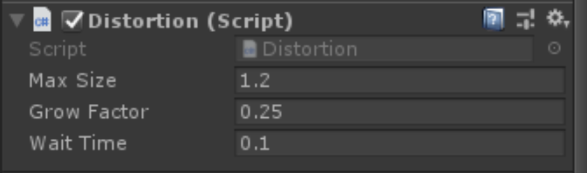
I broke this up into two main functions, movement and distortion. For the expanding and contracting effect I decided to make a script I could attach to my capsules. Now I have mainly an art background, so don't be intimidated by any code I implemented; its fairly simplistic. Essentially, this script has three public variables that allow you to control its grow size, rate of growth, and pause time (lungs have a slight pause in between expanding and contracting so this was necessary).


That's it. That simple script gives you these variables in the inspector and they can be fine-tuned for specific purposes. Max Size lets you put in a positive or negative value. Be warned though, this assumes the scale of the object is 1,1,1. So any scaling should be done prior to Unity. Grow Factor is the speed at which the object will grow. Last, Wait Time indicates a delay before the object shrinks back to its original size. This can be set to 0 if not needed, depending on the function.

After applying this script I determined it worked quite well. I could have two separate lungs (left and right) and apply different variables so one behaves "normal" while the other indicates a tension pneumothorax. It allows for a multitude of different behaviors depending on how you play with the settings. This handles the movement function of the effect, but we still need to tackle distortion.

In order to heavily distort things viewed through the effect, I created a custom shader. As shaders go, its nothing terribly complicated.
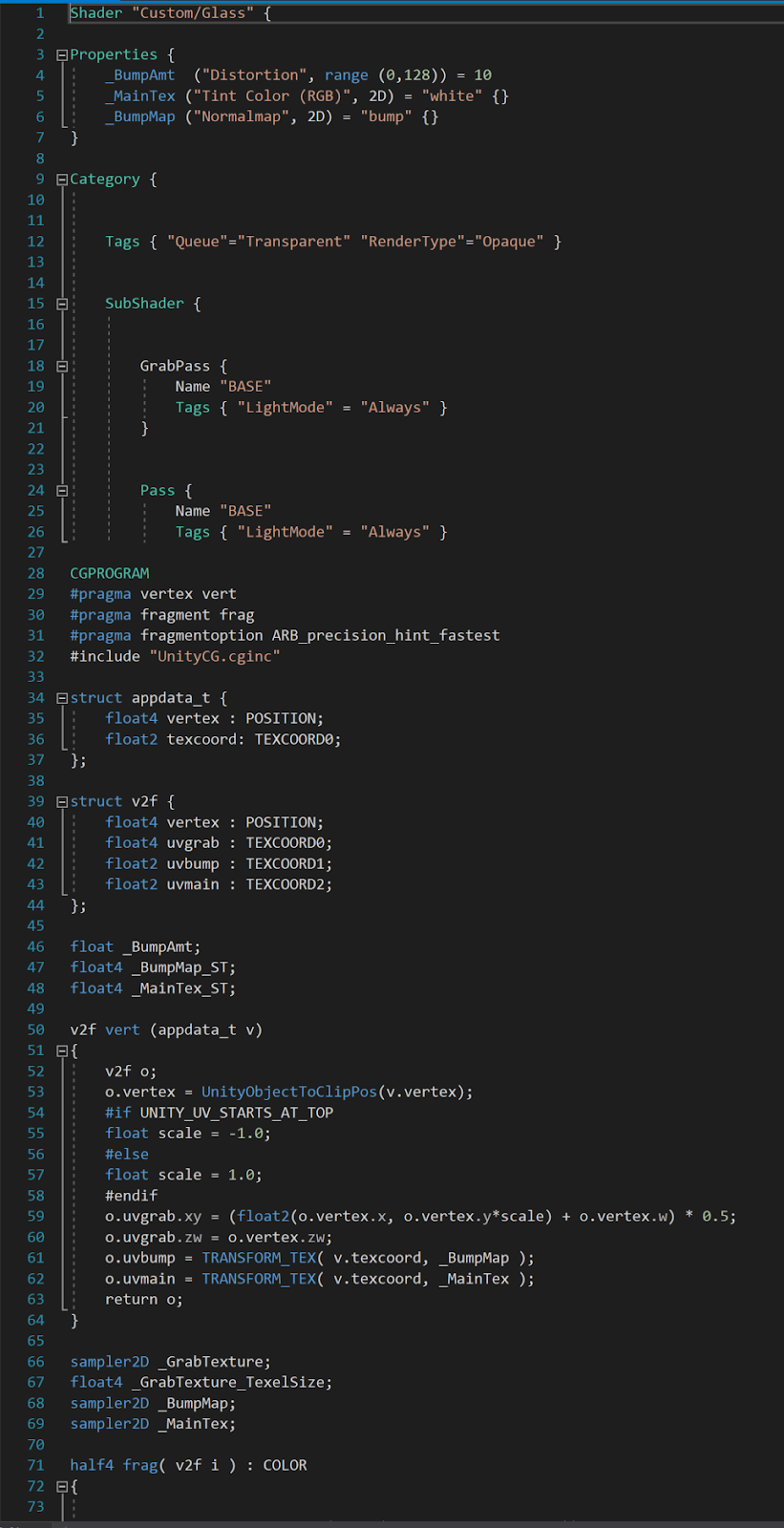
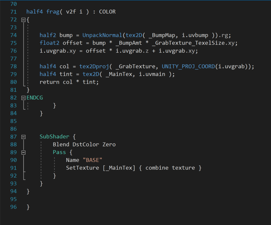


This shader works by grabbing a snapshot of the textures behind it and then running a distortion function on them, supplied by the user. So the output for this shader allows for two maps, an RGB Tint Color and a Normal Map. These maps will add to the distortion of things behind them.


You can plug in the desired maps for the normal and tint desired. There is also a public function slider that lets you control the impact of the distortion. This shader worked great in combination with the movement script already attached. It distorted the objects behind it, and the expanding and contracting of the effect lead to the appearance of expanding and contracting on other objects. I was able to successfully test in Unity and in VR on the HTC Vive. However, the real challenge was about to begin: how do I transfer this to a system that will affect the real world around it? 

The short answer is, it isn't possible. There are a few exceptions. You could mount a forward facing camera on the Vive, and then overlay the holograms on that captured environment. This will however cause a good deal of lag, so we didn't consider it as an option. So we were left with coming up with a way of making it appear to affect the environment. At this point, I got sucked down a rabbit-hole. I turned to one of our developers (a not-artist, if you will) and we were able to work together, by combining the functions I had with one of his own creation. He supplied a shader that would hide all objects rendered behind it. This way the affect wont be seen on other objects in the scene. Here is that shader. 


Next, we flattened the capsules from the effect so they wouldn't collide with anything else around them. Then I placed an object behind the effect that has a transparent shader. So that object isn't visible in AR, but exists and thus allows for the effect to be seen. By placing this object behind the effect, it was clearly visible in AR. Here is the same effect applied to a different asset. You can see the distortion happening inside the highlighted area. This will also expand and contract when played.


So ultimately, we found a cheat that allowed us to push forward and have a successful effect that distorts things in the real world. It was a huge challenge, took several weeks of work, but ultimately it was very rewarding to get it working. Again, I apologize I can't currently show images, but after the product has shipped I can come back and add those in.


Sunday, August 20, 2017

UI/UX Design: A Reworking of Subnautica's Interface

Overview

Subnautica is an open-world survival game currently available through early-access on steam (as of the time of this publication). I love the immersive atmosphere of the game and the stunningly beautiful geography. This game is full of creative innovations and I have enjoyed it thus far with only one exception: the user interface. So I decided to do a critical analysis of the design and usability principles being used in the Subnautica UI to evaluate if changes could be made to improve the player's immersion.

Identifying Issues

To accomplish this, I used Universal Principles of Design, by William Lidwell, Kritina Holden, and Jill Butler. I started off by just playing the game and jotting down notes of thing I noticed. Then I consulted the design principles to identify and understand any issues in the user interface. This collection of principles helped me identify 5 key elements that were lacking: Uniform Connectedness, Comparison, Immersion, Mental Model, and Propositional Density. Here are how they are defined in Universal Principles of Design. 

Uniform Connectedness: Elements that are connected by uniform or visual properties, such as color, are perceived as being more related than elements that are not connected.
Comparison: A method of illustrating relationships between patterns in system behavoirs.
Immersion: A state of mental focus to intense that awareness of the real world is lost.
Mental Model: People understand and interact with systems and environments based on mental representations developed from experience.
Propositional Density: The relationship between the elements of a design and the meaning they convey.

These principles of design mostly focus on the relationship between the player and the user interface. They are all related to each other and will help make a seamless interface.

Here is the current user interface, in-game. 


As you can see, the game is full of these really immersive environments, but the UI pulls you out of that. Changing between tools means looking at icons just floating over the first-person perspective. The stat overlays (oxygen, health, nutrition, and dehydration) look odd as well. The color and theme are not coherent or constant between elements. So it will obviously be important to tie these elements together, bringing uniformity and immersiveness to the player. 

Prototyping Solutions

One system already used in the game is the PDA, an in-game interface that allows players to conduct various tasks. The important thing about the PDA is that it's digetic, allowing us to maintain immersion without losing functionality. Its something I kept in mind while examining solutions. I started by scrapping the entire UI. The tool selection, stats, and depth were all removed so I could start from scratch. I then started reworking the stat overlays.

First, I started workshopping different ideas for to to relay this information without using icons. To really help sell the immersion of this information, I decided it should all be incorporated into the gameplay itself. After doing some research on what real symptoms would arise from dehydration and starvation, I had a strong foundation. This foundation, of stats being relayed through physical changes, also served to tie all the elements together. 

Immersive Stat Overlays

Stat                                                                                                               Suggested Interaction
Health                                                     Blood on inside of visor, flooding more as damage is taken
Oxygen                                                                                                           Bubble Gauge Indicator
Dehydration                                                                                                  Blur/dizziness to emulate
Nutrition                                                                                                    Hands shake/hypoglycemic

Initially, I thought it would be interesting if the tools were being projected through Augmented Reality on the PC's hand.


This seems to be more intuitive to the VR version of the game, but I wasn't sure it would translate smoothly. While hotkeys 1-5 are still used, the icons are moved off the floating UI and instead projected on the character's hand.

Eventually, I decided to get rid of the icons and go with a holographic projection, since this is a sci-fi game, but I think either one works.


Changes took several iterations to find a system that congruently presented itself as immersive to the game world. Finally, I landed on these changes.

New Interface


Since dehydration and starvation are now conveyed through visual feedback systems, there is no need for them in the UI. Since starvation will be shown through shaking hands, there is no real way to show this through a screenshot. Here is another look at the UI however, with dizzyness and blurriness being shown to indicate dehydration.


And one last show showing what a high damage scenario looks like.


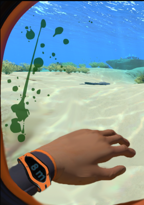
Alternatively, I was informed that blood appears green underwater, due to the nature of the water absorbing the color red. Here is an alternative blood color to help weave together more immersiveness. It also makes the game more "alien" in nature, which fits with its genre.


Conclusion

So in conclusion, I think I was able to identify a few areas of the user interface that really benefited from immersive changes. Through design principles, I was able to create a user interface that is (hopefully) more intutitive and easy for the player to use, without losing functionality or immersion in the game world. Here is a final side-by-side comparision of the UI, mine and the original.


Monday, October 10, 2016

Ozone (Game Design Project)

Last week, in Game Design class, I was tasked with creating a Game Design Powerpoint Pitch, Game Mechanics Document, User Interface mockups, and a Prototype. I was given a couple stipulations in regards to the game design.
  1. First, the game would have to involve a social issue (similar to Games for Change) in some way. 
  2. Second, the game should involve a unique form of player movement outside of industry norms such as running, walking, jumping, crouching, etc. 
For this project, I decided to collaborate with Justin Hentges, a fellow student in the Game Design program who also has a background in Game Art.

First, Justin and I decided to brainstorm ideas for the game, focusing on the two stipulations given for the design. We got really lucky and developed a good narrative early on that lent itself to both of our goals: a turn-based strategy in a sci-fi setting against a parasitic race. We took this idea and evolved it into Ozone, a game where the player assumes the role of planet earth, pitted against the humans who are polluting and destroying Her. Environmentalism is a shared passion that me and Justin found out we shared, and it's a growing problem. Why not make a game, marketed towards teen kids, that can show the dangers of humanity's impact on Earth in an engaging way?

We would also allow players to taking control of the entire Earth. Through both localized attacks and galactic movement, players would get to move as a celestial body.

When determining the genre and world of the game, we featured
After building upon the core mechanics of the game, we came up with a very exciting and interesting game. Here are some really interesting bullets of the design that we came up with:

  • Player's health would be displayed in a unique way, as the Ozone layer. Being able to see a physical representation of the health was something we really liked because it allows for an education display versus a simple HUD element.
  • All mechanics of the game will be based on an internal historical database of scientific data. Planet movement, strategic attacks, AI response, and correlations between effects will have outcomes based on scientific fact, to help back up the educational factor of the game.
  •  We decided that on the first play, we would present a tutorial that starts at the Industrial Revolution and ends at the current time. This will allow players the ability to learn the mechanics of the game in a known setting. Being able to prepare for known events will prepare the player for the more complex interactions that take place during the futuristic game play.

Here's the initial design pitch we came up with:


Monday, September 28, 2015

Art Creation for Games (Final Project)

The final project for Art Creation for Games involved putting together all the skillsets learned this month. The requirements were to build a complete environment in Unreal Engine 4. For this project, I chose the following reference image from the ones supplied:


The idea wasn't to replicate the environment exactly, but to use it as a basis for our project, while injecting my own creativity and ideas. This way I could show off what I learned throughout the month. I did the majority of the work for this project in Maya 2016, Photoshop CC 2015, and Unreal Engine 4. I created all the meshes and laid out the UVs in Maya. I then created textures for everything in Photoshop. Finally, I compiled everything in the scene in Unreal Engine. Here is the final result:

I also took a couple screen recordings of the environment. This first one is just me navigating the scene in Unreal. 


                                          The second one is the actual gameplay in Unreal. 


Overall, this was the most enjoyable project I have had since starting school at Full Sail University. I really got to see all my talents and skills combine into one glorious environment. I will definitely keep working on projects like this in my free time and look forward to learning more about Unreal Engine 4. 

Saturday, September 12, 2015

Art Creation for Games (Lesson #3, Texture)

In my last post, I showed the process of laying out UV's for meshes in Maya. The next lesson for Art Creation for Games involved building upon that foundation. Solid UV work is a vital part of the texturing process. There are two different types of textures used in video games, Collage Textures and Tiling Textures. Collage Textures are unique and created for a specific asset such as a character or individual item. Tiling Textures are seamless and created to repeat or tile. This type of texture could be used for surfaces such as a brick wall or a tiled floor. Below are some examples of both types of textures. 


Examples of tiling textures via Art Creation for Games curriculum. 


Example of a collage texture via Art Creation for Games curriculum.

I also learned the process for creating textures in Photoshop.

  1. Determine the working size of your texture 
  2. Keep brightness and saturation in the middle 
  3. Remove any obvious details/specific details 
  4. Add detail from large to small 
  5. Consider use and size on screen when adding details

The Archway

Time to implement it! For this lesson, I was given three different assets to texture. The first asset was an archway. 

Base mesh.

Texture provided for archway.

I started off by fixing some issues with the face normals. Autodesk defines normals as, "a theoretical line that is perpendicular to the surface of a polygon. In Maya, normals are used to determine the orientation of a polygon face (face normals), or how the edges of faces will visually appear in relation to each other when shaded (vertex normals)." This means all the face normals need to be pointed in the correct direction to ensure the texture is visible. 

The spikes show the orientation of the face normals for the geometry. Notice they are all pointing the same direction after I applied conformity to them.

Next, I moved on to laying out the UVs of the archway and then importing the texture. I made sure all the UVs were proportional to ensure the texture wouldn't stretch on the archway mesh. 

Screenshot of UV layout in Maya.

As you can see in the screenshot above, I laid out the UV's over the corresponding part of texture I wanted that piece of geometry to have.  With the normals oriented correctly, my UVs laid out, and the texture properly applied, I am ready for a final render. 


Final render in Maya, utilizing MentalRay.
Overall, I was satisfied with the final project. As you can see, you are able to add a considerable amount of detail to a basic mesh by utilizing textures. Next, I will be moving onto the second part of the assignment: texturing a barrel. 

The Barrel

I started off with the base mesh of the barrel, provided to me.

Base mesh for the barrel.

 I started off by repeating the process I did for the archway; cleaned up the face normals and laid out the UVs. The texture for the barrel that was provided was actually two textures, one for the wood and one for the metal.


Textures provided for the barrel.

In order to have an easier time laying out the UVs over these textures, I took them into Photoshop. In Photoshop, I combined the two textures into one. 

Combined textures.
After bringing the texture into Maya, I simply laid the out the UVs for the barrel to match the corresponding material I overlaid all the metal bands on top of each other over the metal part of the texture and then laid out the rest of the barrel on the wood part of the texture.

UVs laid out on my new texture.
 Last, its time to generate the final render for the barrel. After setting up a couple area lights to really showcase the texture, I rendered out the barrel with MentalRay.

Final render in Maya, utilizing MentalRay.

The Pipes

The last asset for this assignment was a configuration of plumbing pipes. This was a more complex mesh because, unlike the archway and barrel, it contained variety of of different parts with differing proportions. As with the previous two assets, I cleaned up the normals and laid out the UVs. The texture for this asset was a basic checkerboard pattern that allowed me to check for squashing and squishing of the UVs. 

Base mesh for the pipe asset.

Provided texture for the pipe asset. 
After laying out the UVs I imported the texture. As you can see, I tried to keep the UVs as simple as possible to avoid proportion issues.

UV layout for the pipe asset. 
After that, I was ready to create the final render!

Final render in Maya, utilizing MentalRay.

After completing these three assets, I definitely feel a lot more comfortable with UVs and textures in Maya. I will keep working on these methods in the future to continue to increase my competency. All of these skills will build a strong foundation for the next lesson, "Block out, Mid, High Res & In-Game builds."

Friday, September 4, 2015

Art Creation for Games (Lesson #2, UV's)


Lesson 2 dove into UV's. The project involved modeling part of toilet in Maya, laying out the UV's, and checking it with a checkerboard pattern. 
Reference Image


Maya Build
UV's for build.


Checkboard Pattern UV Check.

This is the perfect setup to use before applying a texture to ensure the UV's are not suffering from extreme squash and stretch.

Tuesday, September 1, 2015

Art Creation for Games (Lesson #1, Pipeline)

Today I started the Art Creation for Games course, which aims to "provide students with a strong knowledge of the way real time 3D content is modeled and textured. Students develop game models of simple and complex props, foliage, and various game environments. In addition to modeling, students paint color, generate normal maps, and specular maps for created geometry. Special attention will be paid to the creation of clean and optimized models for use in games." (Full Sail University 2014 Course Catalog).

Lesson 1 covered the industry pipeline. We discussed the various software used in art creation for video games, terminology, concepts of game modeling, and culling. The first assignment for the course involved working with a reference image of a Mame arcade table. 


I took the image into Photoshop to create a breakdown of the object. This allowed me to identify various components of the object and determine what assets could be reused throughout the model to increase efficiency. 


I then proceeded to Maya to block-out the mesh. I utilized the breakdown and reference image as the foundation for my mesh in Maya. I also imported a human mesh provided to use as a standard for the size and proportions of my arcade table. This human mesh represented the proper scaling used in Unreal Engine 4. 


After completing my block-out, I duplicated my mesh to begin modeling the in-game mesh. I took my duplicated block-out mesh and proceeded to add secondary and tertiary details while consulting my references. I duplicated objects that could be reused throughout the mesh such as the joysticks and control buttons. 


This was a quick build, and the project was done during a three hour lab. I learned quite a bit about the pipeline of video game art creation and was able to implement a lot of the techniques taught.