I recently read Mastery, by Robert Greene. In the book, Greene explores masters of their craft, and the paths they took to get there. Obtaining the title of "Master" is not done overnight, but there are daily strategies you can employ to get there. After reading this book, I noticed a lot of similarities in the attributes of a master in someone in the video game industry: Brian Fargo. Fargo is highly accomplished in the video game industry and so I decided to examine his path to mastery to see how it aligned with Greene's theories. I went through interviews, presentations, and even my own personal correspondence with Mr. Fargo to examine the path of success in the video game industry.
Wednesday, July 18, 2018
Thursday, July 12, 2018
Creating LOD Planes
A constant struggle in the art world
involves fine-tuning Level of Detail, or LOD. On a current project, I was
presented with a scene that would need thousands of iterations of assets, all
while supporting 90 FPS (the target FPS for VR). I came up with a unique
solution that works, because this scene is laid out inside an aircraft,
essentially a long hallway. Since you only approach objects from the front or
the rear, I decided to use planes for the last LOD level, since they only consist of 4 tris. Here is my process.

When you are
ready to create the last LOD level, set up your scene for the
plane capture
process. Remove all unwanted objects from the scene to stop them from being
rendered.
Create a
backdrop that will contrast well with the asset in question. For most assets, a
green screen works well, but a blue or red screen can also be used. I simple
set up two planes, and applied a StingrayPBS material with a flat color. Be
sure to get rid of all metal and roughness values to create a “flat” material.
Next, set up the lighting for your scene, by selecting Lighting<Use Flat Lights. This will help you get a render shot
that doesn’t interact with light. Since this image plane will be used for the
last level of the LOD group, it is important to have a clean image.

Open up the
Render Viewport and then set the Render type to Maya Hardware 2.0 Then, open up the Render Settings window.

Once opened,
change the Renderable Camera to the
desired one. For most assets, the Front camera will be the best to get a
straight shot of the asset. Additionally, consider rotating the object 180
degrees for the rear render shot, instead of setting up a new camera for a Rear
shot.
Next, change
the image size to HD 720 or better to ensure
you are working with a clean, crisp image.

In the
Render Settings, you also must change the lighting
mode to Default mode. If your render shot is black, its most likely because
this setting is set to “All.” Default
will tell it to use the same lighting you set up in the editor (in this case,
Flat Lighting).
After
getting the setup process complete, you can now render your image. Typically,
its easiest to use the orthographic view for these shots. After you are satisfied,
we can move on to exporting out your render shot.
On the Render View, open up
File>Save Image.
Make sure to
select the options button on the
Save Image tab.

This will
open up another window. Change the save mode to “Color Managed Image – View Transform embedded.”

Once done
with the Save Settings, go back and this time click File<Save Image. Name the asset in a logical manner, describing
the asset, and what shot you are capturing. Next, change the file type to PNG.

Next, bring the image into Photoshop.
Get rid of the background through smart selection or Select< Color Range. It
should be easy to grab all the green and then delete it out of the image. Once
all the background is cleaned from the image, select what’s left and create an
alpha channel.

When you are
satisfied with the image and have an appropriate alpha channel, you can export
the image out. Remember when exporting to always save as a Targa or another
format that allows for 32 bits (an alpha channel). Now you are ready to apply
the image to a plane to be used for the desired LOD level. Test in Maya and if
satisfied, add to the LOD group and name accordingly. Export the LOD group to
Unity. In Unity, make sure the texture is set to pull alpha from transparency and the material is set to Cutout. If one is set up already, add
the LOD group to the desired prefab. If no prefab is created yet, create an
empty game object to house the LOD group and create your own prefab. You can
change the LOD distances in the inspector window for testing purposes. It is
recommended to have the distances between LOD switches stay small to
effectively test the transitions. After successful testing you can change the
LOD switch points back to the standard.
That’s it!
Now you have a LOD level that consists of 4 tris (one plane) and still looks like
a high-fidelity model. Granted, this only works because of the environment
layout (an aircraft is essentially a vey long hallway). If you are working in a
more open environment where the player can approach an asset from many
different angles you might have to change your approach. As it stands, for this
project it was a great solution as the player can really only approach an asset
from the front or the rear. No angled vectors that might ruin the illusion. Here's a render shot:
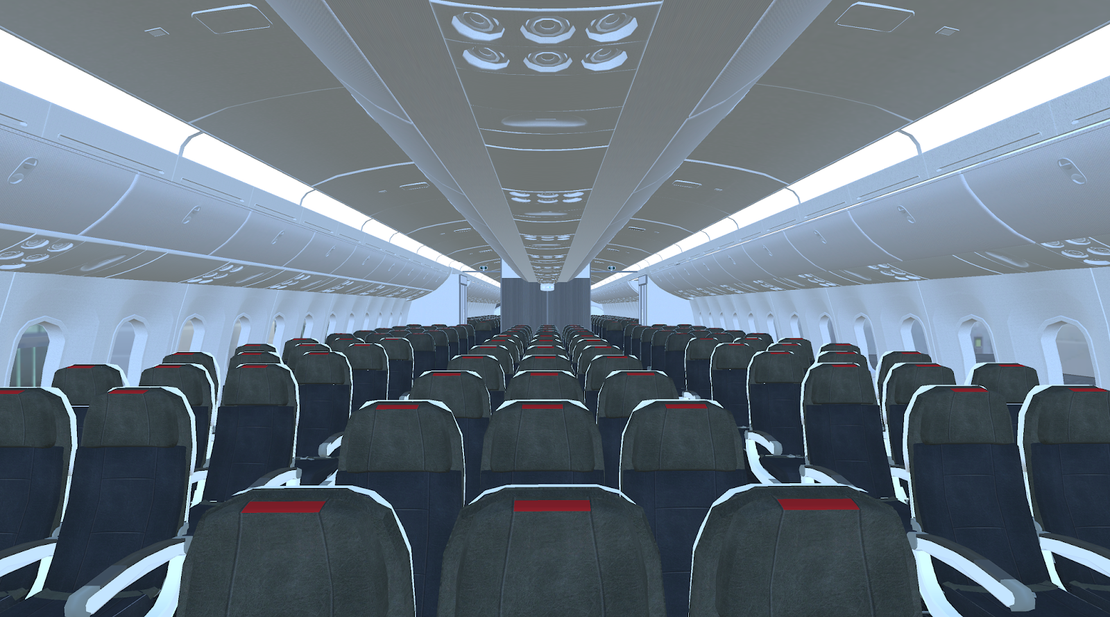

Here you can
see there the plane LOD starts to kick in, about 6 or 7 rows back. At this
distance, the difference is almost imperceptible. It’s a good solution for the
design of the level.
Hope this
little bit of magic will help you in your project or inspire you to something
similar. If so, make sure to share your work and as always, comments and
feedback are encouraged!
Tools Used:
Maya 2018, Unity 2018, Photoshop CC
Tuesday, July 3, 2018
Holograms: Breathing Effect
Been awhile, I've been busy with a new job for the last 9 months. We are currently working on a product that utilizes Unity, the Hololens, and augmented reality. While there are a lot of pieces to this project, there was one "problem space" we stumbled across that I believe is worth sharing with the community. I will state that since this project is still a work in progress and propitiatory, I am not able to show images of the actual results we are using.
The Process: When we first approached this issue, we did extensive research online. We read technical docs for the Hololens, reached out to online communities, and spoke to others in the industry. Everyone told us it was impossible to have a hologram affect the real world. For this project, I wanted an effect that makes movement under the skin, like lungs expanding and contracting. The roadblocks here were that we couldn't use animated models, but rather needed an effect that would always cause this distortion. This would allow to scan ANY person with the Hololens and cause distortion, based off markers.
I started off with two capsules, basic shapes to represent the lungs. Since we need this effect to actually impact the world behind it I established the primary functions that the effect would have to have. First, it would need to be able to expand and contract, mimicking actual lung movement. Second, these would need to be public variables that could be altered based on incoming data. Third, there needed to be some sort of texture to the effect that will add to the overall distortion.
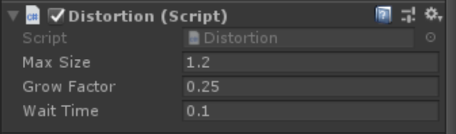
I broke this up into two main functions, movement and distortion. For the expanding and contracting effect I decided to make a script I could attach to my capsules. Now I have mainly an art background, so don't be intimidated by any code I implemented; its fairly simplistic. Essentially, this script has three public variables that allow you to control its grow size, rate of growth, and pause time (lungs have a slight pause in between expanding and contracting so this was necessary).

That's it. That simple script gives you these variables in the inspector and they can be fine-tuned for specific purposes. Max Size lets you put in a positive or negative value. Be warned though, this assumes the scale of the object is 1,1,1. So any scaling should be done prior to Unity. Grow Factor is the speed at which the object will grow. Last, Wait Time indicates a delay before the object shrinks back to its original size. This can be set to 0 if not needed, depending on the function.
After applying this script I determined it worked quite well. I could have two separate lungs (left and right) and apply different variables so one behaves "normal" while the other indicates a tension pneumothorax. It allows for a multitude of different behaviors depending on how you play with the settings. This handles the movement function of the effect, but we still need to tackle distortion.
In order to heavily distort things viewed through the effect, I created a custom shader. As shaders go, its nothing terribly complicated.
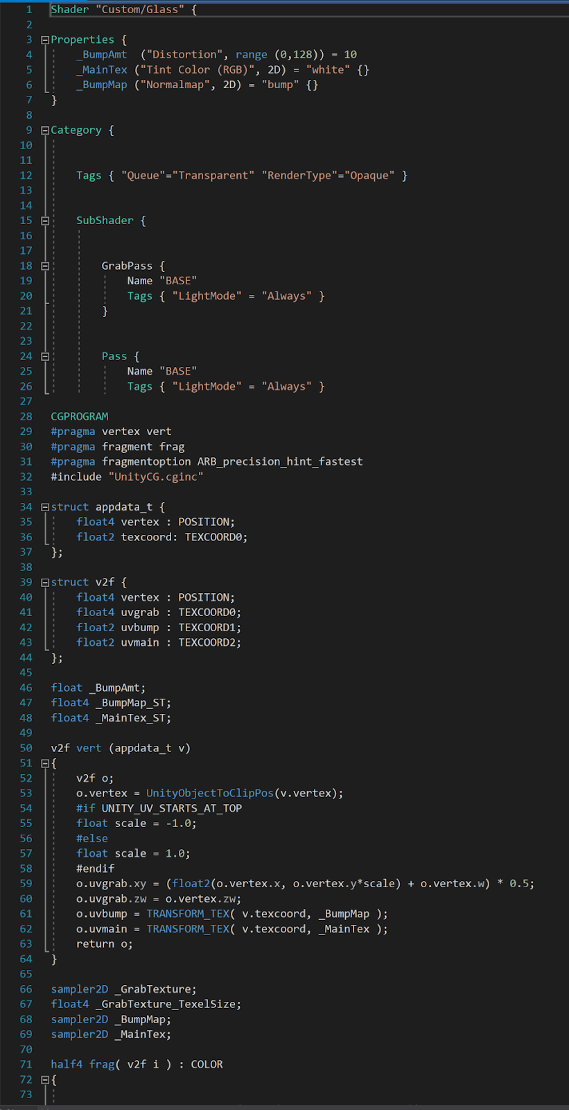

This shader works by grabbing a snapshot of the textures behind it and then running a distortion function on them, supplied by the user. So the output for this shader allows for two maps, an RGB Tint Color and a Normal Map. These maps will add to the distortion of things behind them.


Next, we flattened the capsules from the effect so they wouldn't collide with anything else around them. Then I placed an object behind the effect that has a transparent shader. So that object isn't visible in AR, but exists and thus allows for the effect to be seen. By placing this object behind the effect, it was clearly visible in AR. Here is the same effect applied to a different asset. You can see the distortion happening inside the highlighted area. This will also expand and contract when played.

So ultimately, we found a cheat that allowed us to push forward and have a successful effect that distorts things in the real world. It was a huge challenge, took several weeks of work, but ultimately it was very rewarding to get it working. Again, I apologize I can't currently show images, but after the product has shipped I can come back and add those in.
The Problem Space: How do we affect the physical world through holograms?
The Process: When we first approached this issue, we did extensive research online. We read technical docs for the Hololens, reached out to online communities, and spoke to others in the industry. Everyone told us it was impossible to have a hologram affect the real world. For this project, I wanted an effect that makes movement under the skin, like lungs expanding and contracting. The roadblocks here were that we couldn't use animated models, but rather needed an effect that would always cause this distortion. This would allow to scan ANY person with the Hololens and cause distortion, based off markers.
I started off with two capsules, basic shapes to represent the lungs. Since we need this effect to actually impact the world behind it I established the primary functions that the effect would have to have. First, it would need to be able to expand and contract, mimicking actual lung movement. Second, these would need to be public variables that could be altered based on incoming data. Third, there needed to be some sort of texture to the effect that will add to the overall distortion.
I broke this up into two main functions, movement and distortion. For the expanding and contracting effect I decided to make a script I could attach to my capsules. Now I have mainly an art background, so don't be intimidated by any code I implemented; its fairly simplistic. Essentially, this script has three public variables that allow you to control its grow size, rate of growth, and pause time (lungs have a slight pause in between expanding and contracting so this was necessary).

That's it. That simple script gives you these variables in the inspector and they can be fine-tuned for specific purposes. Max Size lets you put in a positive or negative value. Be warned though, this assumes the scale of the object is 1,1,1. So any scaling should be done prior to Unity. Grow Factor is the speed at which the object will grow. Last, Wait Time indicates a delay before the object shrinks back to its original size. This can be set to 0 if not needed, depending on the function.

After applying this script I determined it worked quite well. I could have two separate lungs (left and right) and apply different variables so one behaves "normal" while the other indicates a tension pneumothorax. It allows for a multitude of different behaviors depending on how you play with the settings. This handles the movement function of the effect, but we still need to tackle distortion.
In order to heavily distort things viewed through the effect, I created a custom shader. As shaders go, its nothing terribly complicated.
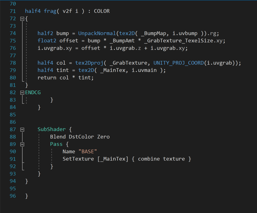
This shader works by grabbing a snapshot of the textures behind it and then running a distortion function on them, supplied by the user. So the output for this shader allows for two maps, an RGB Tint Color and a Normal Map. These maps will add to the distortion of things behind them.

You can plug in the desired maps for the normal and tint desired. There is also a public function slider that lets you control the impact of the distortion. This shader worked great in combination with the movement script already attached. It distorted the objects behind it, and the expanding and contracting of the effect lead to the appearance of expanding and contracting on other objects. I was able to successfully test in Unity and in VR on the HTC Vive. However, the real challenge was about to begin: how do I transfer this to a system that will affect the real world around it?
The short answer is, it isn't possible. There are a few exceptions. You could mount a forward facing camera on the Vive, and then overlay the holograms on that captured environment. This will however cause a good deal of lag, so we didn't consider it as an option. So we were left with coming up with a way of making it appear to affect the environment. At this point, I got sucked down a rabbit-hole. I turned to one of our developers (a not-artist, if you will) and we were able to work together, by combining the functions I had with one of his own creation. He supplied a shader that would hide all objects rendered behind it. This way the affect wont be seen on other objects in the scene. Here is that shader.


So ultimately, we found a cheat that allowed us to push forward and have a successful effect that distorts things in the real world. It was a huge challenge, took several weeks of work, but ultimately it was very rewarding to get it working. Again, I apologize I can't currently show images, but after the product has shipped I can come back and add those in.
Sunday, August 20, 2017
UI/UX Design: A Reworking of Subnautica's Interface
Overview
Identifying Issues
To accomplish this, I used Universal Principles of Design, by William Lidwell, Kritina Holden, and Jill Butler. I started off by just playing the game and jotting down notes of thing I noticed. Then I consulted the design principles to identify and understand any issues in the user interface. This collection of principles helped me identify 5 key elements that were lacking: Uniform Connectedness, Comparison, Immersion, Mental Model, and Propositional Density. Here are how they are defined in Universal Principles of Design.
Uniform Connectedness: Elements that are connected by uniform or visual properties, such as color, are perceived as being more related than elements that are not connected.
Comparison: A method of illustrating relationships between patterns in system Immersion: A state of mental focus to intense that awareness of the real world is lost.
Mental Model: People understand and interact with systems and environments based on mental representations developed from experience.
Propositional Density: The relationship between the elements of a design and the meaning they convey.
These principles of design mostly focus on the relationship between the player and the user interface. They are all related to each other and will help make a seamless interface.
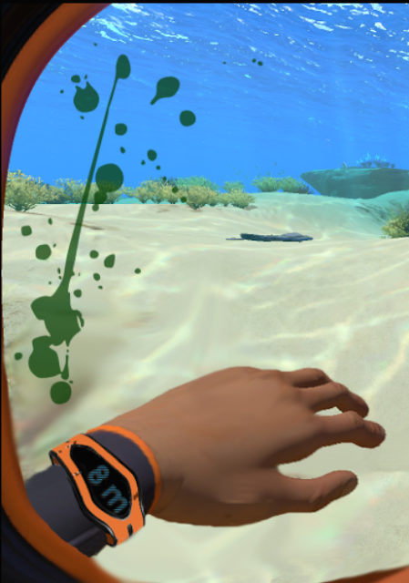
Here is the current user interface, in-game.

As you can see, the game is full of these really immersive immersiveness
Prototyping Solutions
One system already used in the game is digetic Its
First, I started workshopping
Stat Suggested Interaction
Oxygen Bubble Gauge Indicator
Dehydration Blur/dizziness to emulate
Nutrition Hands shake/hypoglycemic
Initially, I thought it would be interesting if the tools were being projected through Augmented Reality on the PC's hand.

This seems to be more intuitive to the VR version of the game, but I wasn't sure it would translate smoothly. Whilehotkeys 1-5 are still used, the icons are moved off the floating UI and instead projected on the character's hand.
Eventually, I decided to get rid of the icons and go with a holographic projection, since this is a sci-fi game, but I think either one works.

Changes took several iterations to find a system that congruently presented itself asimmersive

This seems to be more intuitive to the VR version of the game, but I wasn't sure it would translate smoothly. While
Eventually, I decided to get rid of the icons and go with a holographic projection, since this is a sci-fi game, but I think either one works.

Changes took several iterations to find a system that congruently presented itself as
New Interface

Since dehydration and starvation are now conveyed through visual feedback systems, there is no need for them in the UI. Since starvation will be shown through shaking hands, there is no real way to show this through a screenshot. Here is another look at the UI however dizzyness being

And one last show showing what a high damage scenario looks like.

Alternatively, I was informed that blood appears green underwater, due to the nature of the water absorbing the color red. Here is an alternative blood color to help weave together more immersiveness. It also makes the game more "alien" in nature, which fits with its genre.

Conclusion
So in conclusion, I think I was able to identify a few areas of the user interface that really benefited from immersive hopefully intutitive comparision

Wednesday, August 16, 2017
My Game Design Philosophy
My approach to game design is
based on the philosophical benefits that can be gleaned from video games.
Everything I try to accomplish through design revolves around providing the
player with a challenging experience that promotes creativity through new occurrences.
It is a breakaway from the typical design patterns used in this medium, as it
is built upon the neurological functionalities that occur when playing a game.
This methodology avoids shallow methods seen in the industry at large and
instead focuses on the experience being delivered to the player. It is entirely
about their fulfillment, on a biological level. Through neuroplasticity ,
players can be exposed to stimuli in games that give them a fulfilling
experience.
 |
| Thesis Project |
There are three tenants to this game design philosophy that I have designated as “The Three A’s.” They are Adaptive Gameplay, Active Learning, and Achievement. Adaptive Gameplay refers to constantly changing the challenge presented to the player. One of the key components to promoting plasticity in games involves constantly matching the player’s skill level (Medeiros, 2017). Video game players are used to a typical system where the better the get, the easier the game is. This actually results in a “autopilot mode” on behalf of the player, as no new stimuli is introduced (Kurtzman, 2013). So instead, I implement an adaptive staircase method that challenges the player by making the game more difficult, or stimulating, as they get better. The goal
The second
“A” pertains to Active learning, a
way of presenting stimuli to the player in a manner that promotes an obtained
knowledge through a three-step process (Gee, 2007, pp. 1-27). Game progression
should follow a sequence of learning, thinking, and action (Gee, 2007, p. 78).
Not only should progression follow this pattern, but it should offer multiple
solutions for advancement (Gee, 2007, p. 134). Understanding the different ways
that people learn is essential to avoid bottlenecking player’s through a
supposed “right” methodology of learning. The way to truly analyze this is to
consider all types of problem solving methods and experiment with new ones as
well. Innovation on the designer’s end promotes innovation from the players as
well.
The final
thing we need to accomplish through game design is to deliver a sense of Achievement to the player. Being able
to step back from a game and feel a sense of real accomplishment is vital
(Schell, 2015, pp. 133-146). Without this sense of achievement, a player would
not continue to play the game (Schell, 2015, pp. 133-146). A lot of games focus
on extrinsic, or external, rewards. Instead, design should be focused on
intrinsic rewards to help support creativity and self-actualization in the
player (Gee, 2007, p. 223). Once the player knows what they want from the game,
they can explore creative avenues to get there instead of aimlessly wandering.
These three aspects all work
together in unison to help promote an environment that stimulates the player.
Through this methodology the player is constantly being challenged in ways that
promote active learning and achievement, thus providing them with a truly
enriching interaction not seen commonly in the industry at large.
Experimentation is paramount in progressing a medium forward and should be
cultivated more. This design philosophy fosters freedom for designers to
implement new types of gameplay and change how they are able to interface with
the player.
References
Gee, J. (2007). What video games have to teach us about learning
and literacy: Revised and updated edition (2nd ed ., pp. 1-27, 78, 134, 223).
New York, NY: Palgrave Macmillan.
Kurtzman, L. (2013). Training the Older Brain in 3-D: Video Game Enhances Cognitive
Control. UC San Francisco. Retrieved 10 June 2017, from
https://www.ucsf.edu/news/2013/09/108616/training-older-brain-3-d-video-game-enhances-cognitive-control
Medeiros, J. (2017). How to 'game
your brain': the benefits of neuroplasticity . Wired UK. Retrieved from
http://www.wired.co.uk/article/game-your-brain
Schell, J. (2015). The art
of game design (2nd ed., pp. 133-146). Boca Raton, FL: CRC Press.
Saturday, June 24, 2017
Game Design Post Mortem
The following is a Post Mortem of my time as a Game Design intern while attending the Game Design Master's program at Full Sail University.
Post Mortem: The goal of this section is to reflect on your year and identify critical points of learning.
In your reflection consider - What went right? What went wrong? Why did things go right or wrong? How did things go right or wrong? How did the important events you chose to focus on affect the overall experience?
What is the final takeaway/newfound insight that you are leaving with?
Throughout my year in Capstone I faced several critical moments that would inform my decisions during the overall experience. However, I would like to talk about a single experience that really helped to inform the rest of my time at Full Sail University.
As a game design intern, my role was to help student teams flesh out their design by helping to implement various aspects. As such, the relationship I had with teams was often tense. I was an outsider who, more often than not, was coming in during a late stage of development to help address design or usability concerns. One such experience with a team early on in my capstone would be critical moment of learning.
I was helping a team of developers who were trying to implement some unique design elements into their game. Their implementation left play-testers confused and overall progression in the game was not clear. My role was to help the developers understand the concerns of their target audience and recommend ways to help balance the design between the two parties. When it came time for me to make recommendations, I addressed the group in a casual way and ran through a bulleted list of suggestions. I got blank stares and no response. I considered that there were different methodologies to learning. Perhaps my dry, non-visual approach wasn’t easily conceptualized by the developers?
I tried again, this time emailing them a PDF with recommendations and step-by-step instructions. There was media imbedded throughout the file: images, videos, and gifs demonstrating a certain design element or possible implementation. This got a more positive reaction and I got actual feedback. I realized the audience I was working with simply needed a more visually-stimulating presentation. I made a final PowerPoint presentation, with limited text and more imbedded media. I used screengrabs of other games that the team was trying to emulate; showing them creative ways to implement and balance features. This moment taught me that everyone is different and I can’t make assumptions about how someone else might learn or conceptualize material.
There were a few things I did wrong in this situation. The first was making the assumption that the way I processed information would be similar to the rest of the team. Making a better effort to get a feel for each team member early on would have helped me. I also think it went wrong initially because I didn’t fully grasp their inspiration. Once I had a better understanding for what games had inspired their work, I had an easier time relating material to something familiar to them that also drives their passion.
I think the most important thing I did right was to keep trying until I could make a connection with the team. They could tell that I put in the effort and appreciated it. Going forward, we all worked better at communication to help achieve their goals. I also carried this on to the rest of the teams I worked with during my time in capstone. I strove to place communication above all else. Going into the industry, this experience will help me greatly as I will work at studios of a variety of different cultures and size. Being flexible and adaptable in how you communicate with your team is vital.
Tuesday, April 25, 2017
Star Wars: The Old Republic (A Critical Analysis)
This month, in Game Usability and Testing class, I was tasked with examining how game design elements were used. I decided to evaluate Star Wars: The Old Republic, created by BioWare in 2011. Check out my results below (go full-screen for maximum effect).
Subscribe to:
Posts (Atom)