Overview
Identifying Issues
To accomplish this, I used Universal Principles of Design, by William Lidwell, Kritina Holden, and Jill Butler. I started off by just playing the game and jotting down notes of thing I noticed. Then I consulted the design principles to identify and understand any issues in the user interface. This collection of principles helped me identify 5 key elements that were lacking: Uniform Connectedness, Comparison, Immersion, Mental Model, and Propositional Density. Here are how they are defined in Universal Principles of Design.
Uniform Connectedness: Elements that are connected by uniform or visual properties, such as color, are perceived as being more related than elements that are not connected.
Comparison: A method of illustrating relationships between patterns in system Immersion: A state of mental focus to intense that awareness of the real world is lost.
Mental Model: People understand and interact with systems and environments based on mental representations developed from experience.
Propositional Density: The relationship between the elements of a design and the meaning they convey.
These principles of design mostly focus on the relationship between the player and the user interface. They are all related to each other and will help make a seamless interface.
Here is the current user interface, in-game.

As you can see, the game is full of these really immersive immersiveness
Prototyping Solutions
One system already used in the game is digetic Its
First, I started workshopping
Stat Suggested Interaction
Oxygen Bubble Gauge Indicator
Dehydration Blur/dizziness to emulate
Nutrition Hands shake/hypoglycemic
Initially, I thought it would be interesting if the tools were being projected through Augmented Reality on the PC's hand.

This seems to be more intuitive to the VR version of the game, but I wasn't sure it would translate smoothly. Whilehotkeys 1-5 are still used, the icons are moved off the floating UI and instead projected on the character's hand.
Eventually, I decided to get rid of the icons and go with a holographic projection, since this is a sci-fi game, but I think either one works.

Changes took several iterations to find a system that congruently presented itself asimmersive

This seems to be more intuitive to the VR version of the game, but I wasn't sure it would translate smoothly. While
Eventually, I decided to get rid of the icons and go with a holographic projection, since this is a sci-fi game, but I think either one works.

Changes took several iterations to find a system that congruently presented itself as
New Interface

Since dehydration and starvation are now conveyed through visual feedback systems, there is no need for them in the UI. Since starvation will be shown through shaking hands, there is no real way to show this through a screenshot. Here is another look at the UI however dizzyness being

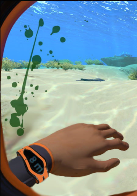
And one last show showing what a high damage scenario looks like.

Alternatively, I was informed that blood appears green underwater, due to the nature of the water absorbing the color red. Here is an alternative blood color to help weave together more immersiveness. It also makes the game more "alien" in nature, which fits with its genre.

Conclusion
So in conclusion, I think I was able to identify a few areas of the user interface that really benefited from immersive hopefully intutitive comparision

No comments:
Post a Comment